mirror of
https://github.com/Sevichecc/Urara-Blog.git
synced 2025-07-12 15:27:18 +08:00
4 KiB
4 KiB
| title | slug | tags | created | summary | lastmod | |
|---|---|---|---|---|---|---|
| CSS · 三种布局方式 | css-layouts |
|
2022-01-13T10:07:00.000Z | Float / Flexbox / Grid / | 2022-05-07T05:30:20.613Z |
课程:Build Responsive Real-World Websites with HTML and CSS
Overview
Box-sizing
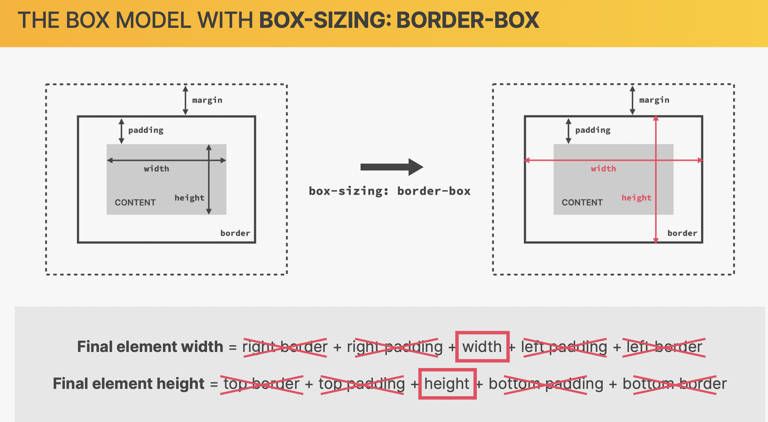
未定义之前:content-box
reset
* {
  margin: 0;
  padding: 0;
  box-sizing: border-box;
}
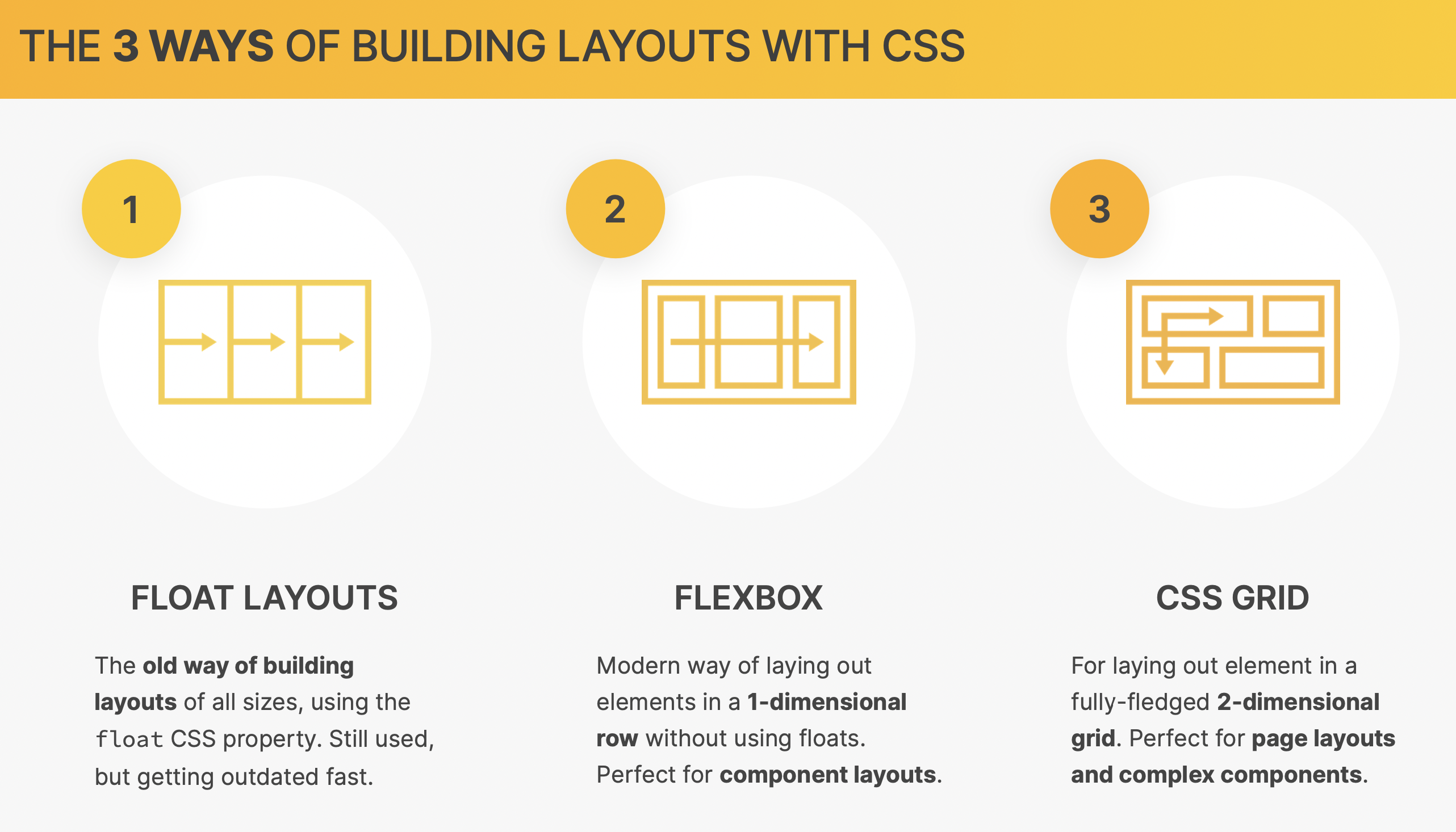
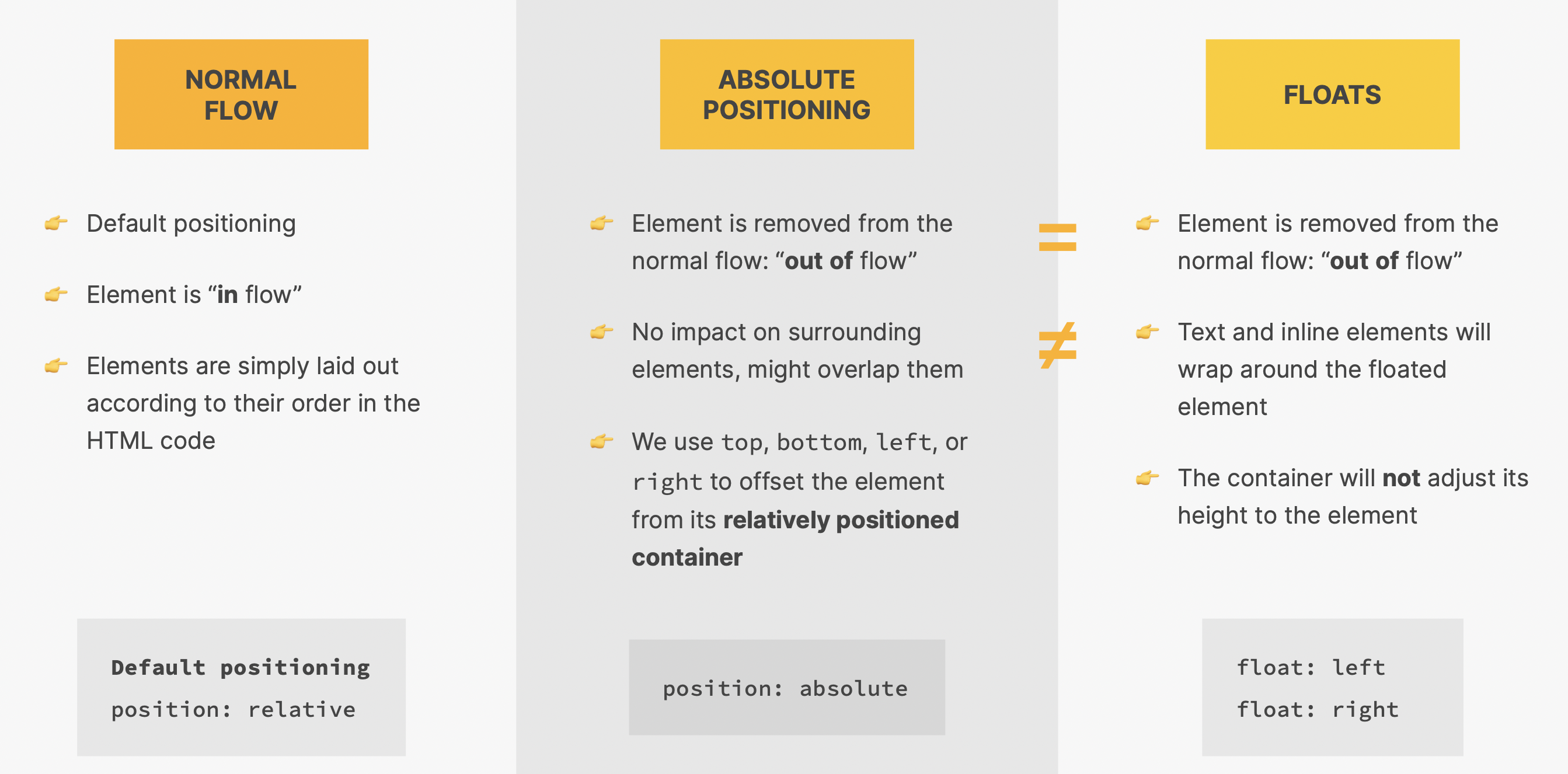
Float Layout
- 浮动在页面之上,对周围元素没有影响
- 现在很少用了
left
- 浮动到页面左边
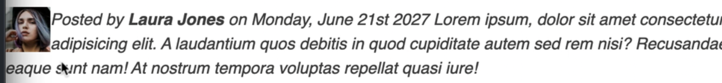
.author-img {
  float: left;
}
此时图片和文本不在同一个层面上
right
浮动到页面右边
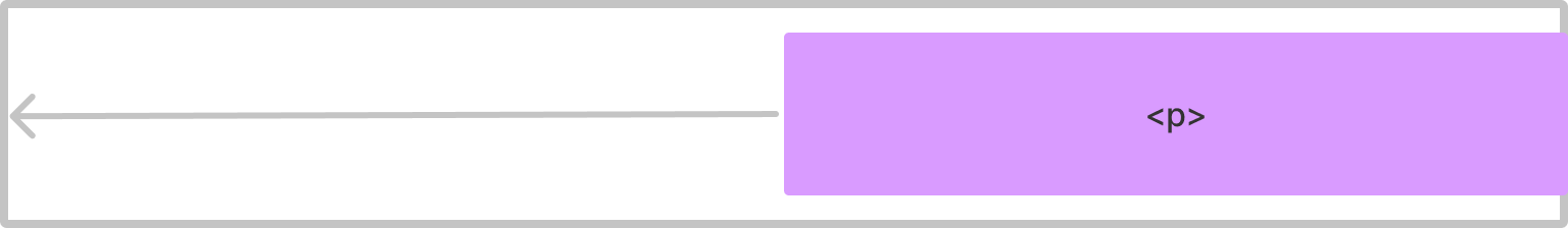
p {
  float: right;
}
ABSOLUTE POSITIONING VS. FLOATS
Clear Float
- 当没有其他元素可以 clear float 时,在其后新建一个元素设置 clear
- 当存在需要清除的元素时,直接在该元素上清除
方法 1: empty div
使用一个并列的空<div>元素来清除
<head>
  <h1>title</h1>
  <h2>title</h2>
  <div class="clear"></div>
</head>
/*清除两者*/
.clear {
  clear: both;
}

/*清除左边*/
.clear {
  clear: left;
}
方法 2:clearfix hack
原理和 empty div 的方式一样,但更简单,利用 pseudo element 在 parent element 后增加一个元素
<head class="clearfix">
  <h1>title</h1>
  <h2>title</h2>
</head>
.clearfix::after {
  clear: both;
  content: '';
  display: block;
}
Flexbox
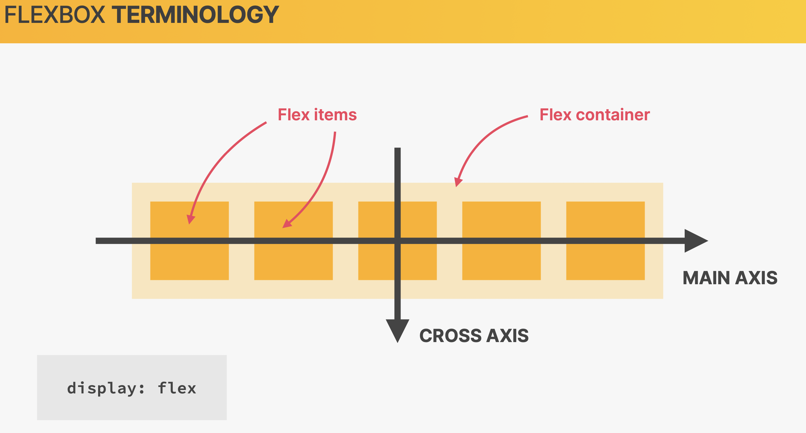
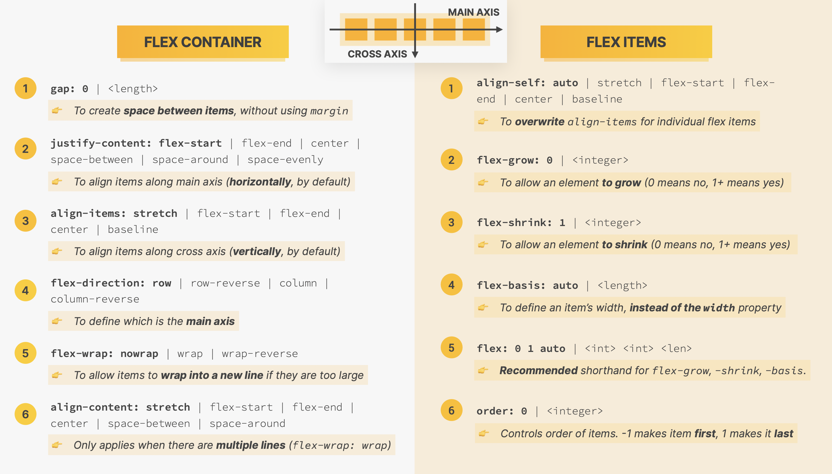
加粗字体为默认状态
.container {
  display: flex;
  align-items: center; /*水平居中*/
  justify-content: center; /*垂直居中*/
}
Flex container
- flex container takes the height of the tallest items
常用:
.container {
  display: flex;
  align-items: stretch;
  justify-content: flex-start;
}
Flex items
.items {
  align-self: flex-start;
}
Propetities
order
数字越大越靠后
flex-grow
数字越大占比越大
flex-basis
item’s width
shorthand
flex:1 =
flex-grow: 1;
flex-shrink: 1;
flex-basis: 0%;
CSS Grid
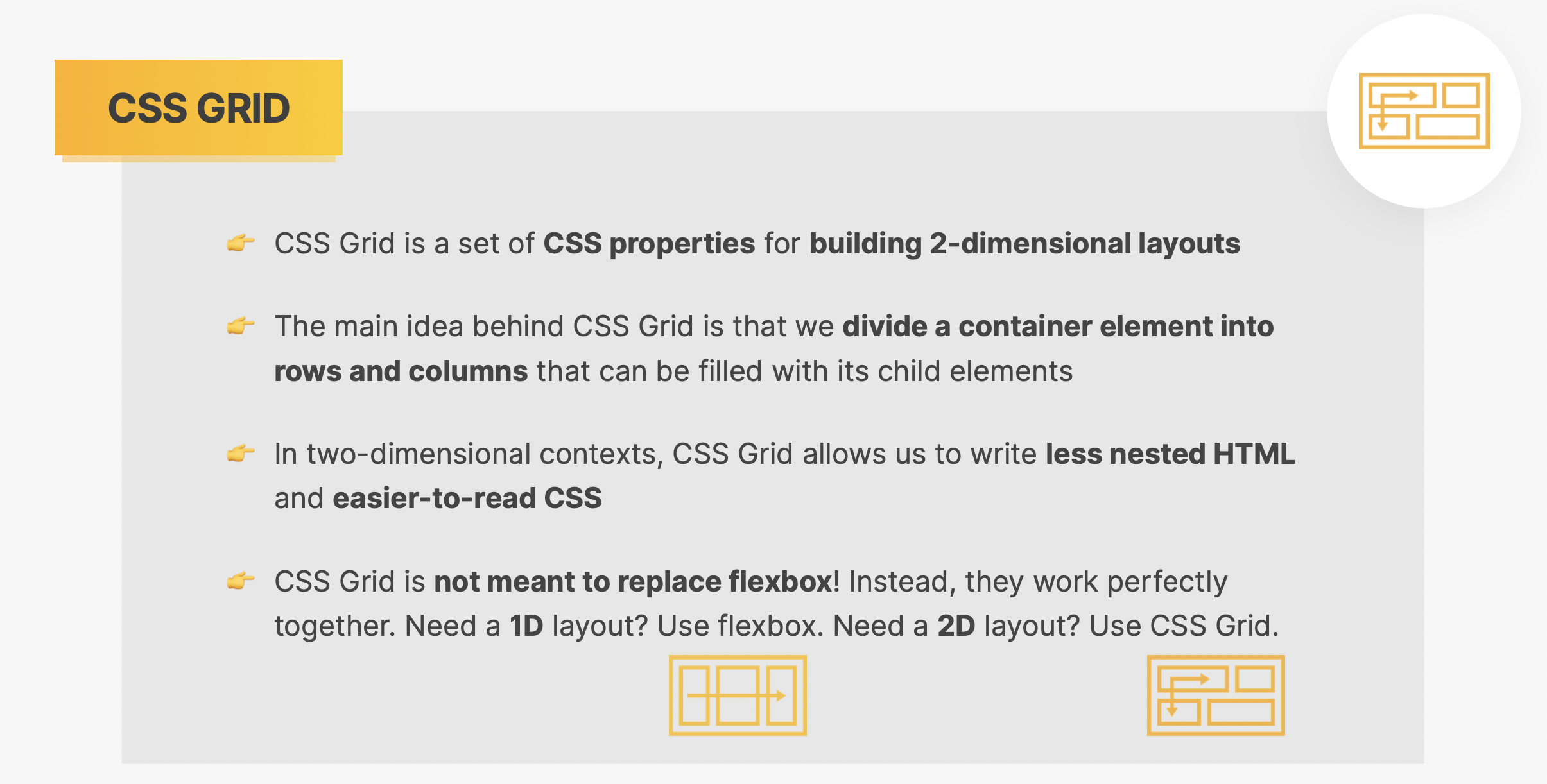
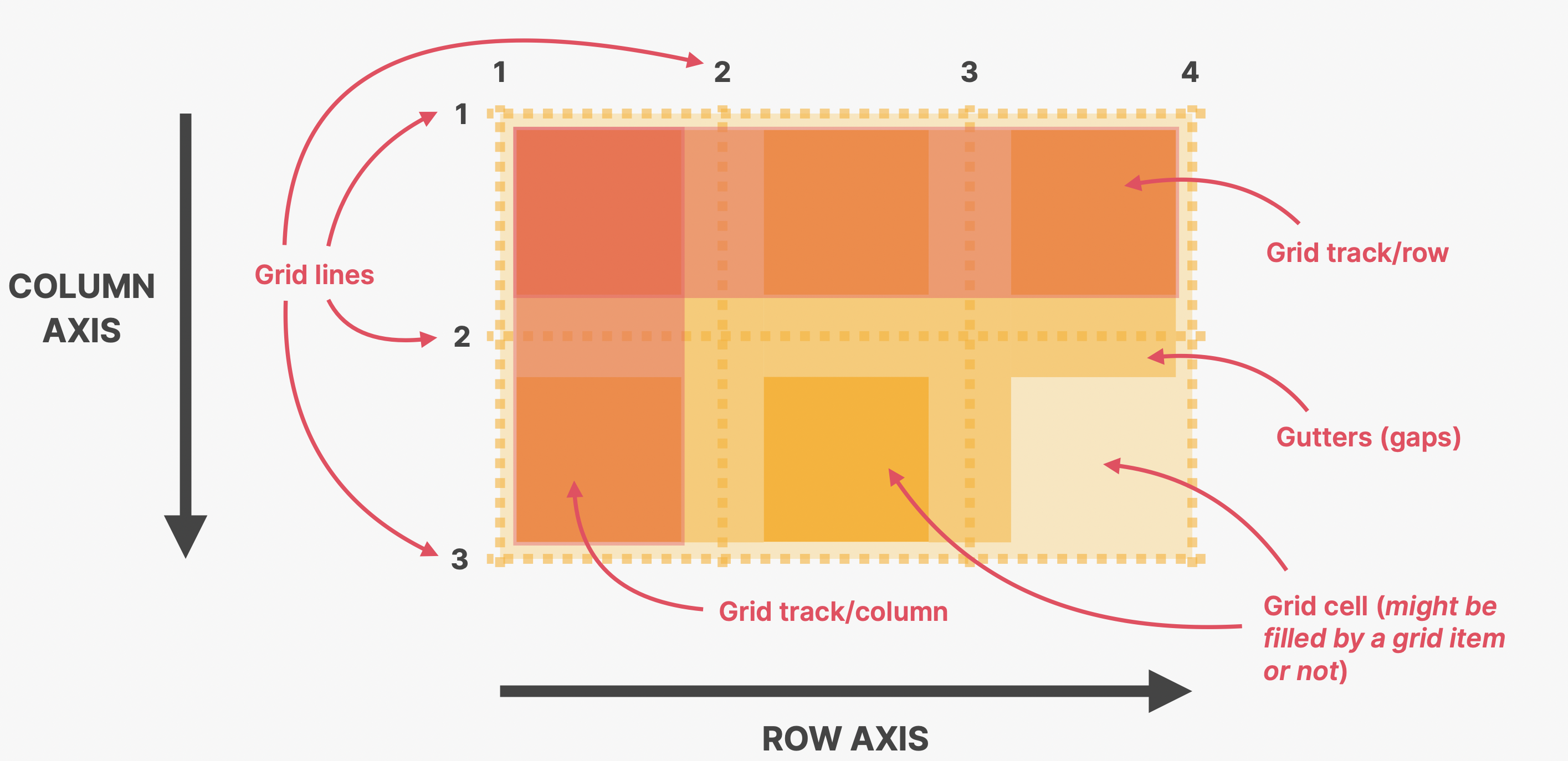
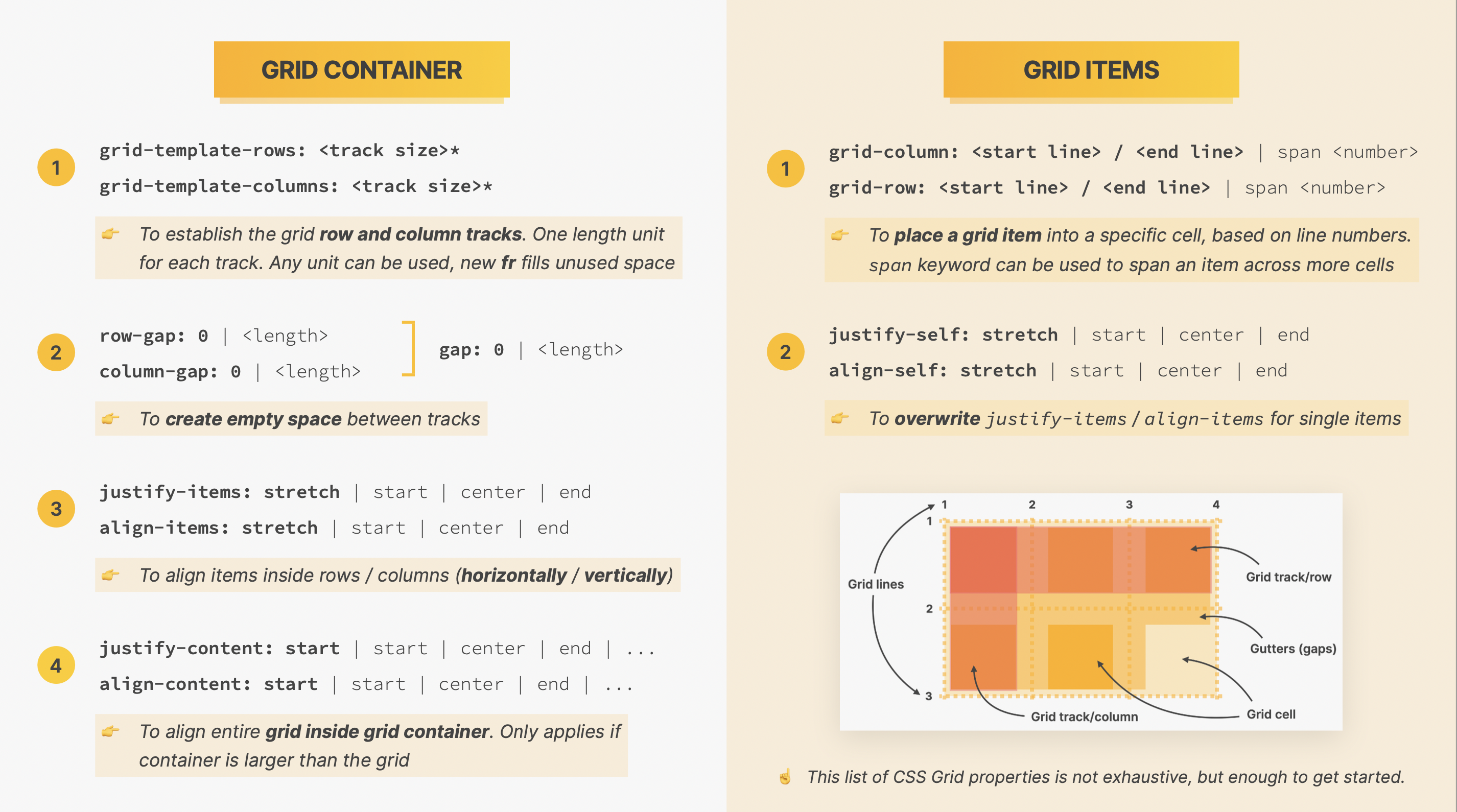
grid container
.container {
  display: grid;
  grid-template-columns: 250px 200px; /*两列*/
  grid-template-rows: 200px 200px; /*两行*/
}
通常不定义 rows
Gap
用 gap 而不是 margin:
.container {
  /*gap:20px;*/
  columns-gap: 30px;
  row-gap: 20px;
}
align tracks inside containers
when the content is smaller than the grid
justify-content: center;
align-content: center;
grid items
.items: {
  grid-column: 2/3; /*当前后数值相差只有1位时,可省去后面的数字*/
  grid-row: 2/3;

  /*占几个列/行时*/
  grid-column: 1/3;
  grid-row: 1/3;
  /*或者*/
  grid-column: 1 / span 3;
  /*自动填充剩余空间*/
  grid-column: 1/-1;
}
align items inside cells
.container {
  align-items: center;
  justify-items: center;
}
.item {
  align-self: end;
}
fr
1fr:自动填充剩余空间- 2:1:1:1 的四列
.container {
  grid-template-columns: 2fr 1fr 1fr 1fr;
}
/*shorthand*/

.container {
  grid-template-columns: repeat(4, 1fr);
}
implicit row
所定义的空间被用完后多出来的列